Thursday, April 19, 2018
Cloris Logo Iteration #1 Feedback
I definitely know what direction to go in after critique. I'm playing around with my forms more but I also want to sit down and really connect them with the brand characteristics. I believe the marks I created fit the brand characteristics we described, though I admit I did not start with those characteristics as a base when I began creating them. It was more of an accidental process, but I think the results of that process can be applied to this branding - I just need to make sure that as I continue to develop and refine that I keep these characteristics in mind.
Thursday, April 5, 2018
Cloris Awards Info Reflection
After speaking with Michael I think there are a few things that I think will work best for this identity. Michael was fairly wishy-washy on like sophistication level but I think it's really important to make this a high-class event. While this is Iowa, many people get dressed up just to go see a show (I know sometimes I would get dressed up even to go see a high-school production) and as Neil said he felt underdressed in a fairly nice outfit. I also think having this be like a fancy event will help entice more people to come - people love having a reason to get dressed up and feel fancy for an evening and the theatre is very conducive to that. Many people see the theatre as a fine art (which it is) and treat it with more dignity and class than perhaps other live events. Also, he kept mentioning them basing this off of the Tony's and the Oscar's which are all very high-class events.
I think I would really like to get to work on the website. In my mind, the website is the most important part of this process. As Michael said, at this point they're fairly disorganized and the website will be essential to helping the organization as well as the theatre companies to better organize and understand what is going on in regards to the Cloris Awards.
I'm excited to get to do more research and really solidify what this brand means and how we can best represent that for them.
Wednesday, March 7, 2018
Moberg Gallery Animation
Viewing this piece in its intended environment was definitely different than viewing it in class. Viewing the piece on such a large scale really changed how I saw it. The scale and really the texture of the building really changed how I viewed this piece. I've seen this piece driving past before and always saw it as just abstract shapes, it wasn't until I viewed it in class that I realized it was a video with an actual subject. However, even after knowing the subject of the video I found that the scale, angle, and texture of the building really obscured the subject for me and made it difficult for me to not see only those abstract shapes. (I did also have one martini before viewing this, so that potentially could have lead to some vision issues.) Overall, I think its interesting that this is the intended environment for this piece as I think it makes the meaning and subject of the piece much more difficult to understand.
Thursday, February 22, 2018
Bike Poster Critique 2
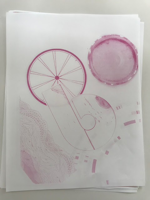
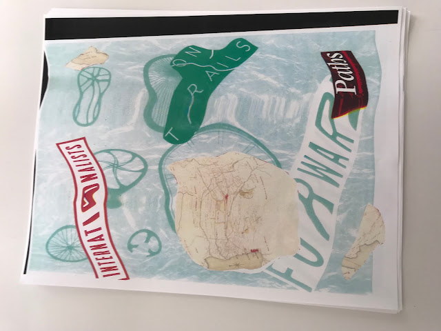
After seeing my poster up with all of the others I definitely realize I need to make my poster a bit more dynamic/visually interesting. I think grounding the bike in a bit more of an actual space will help a lot. I still want it to be a fairly abstract reference to the Botanical Garden - but it definitely needs a few more elements/tweaks to get it there. Gotta do what I can to not have a salad bike!
Tuesday, February 20, 2018
Bike Poster Critique
I love the botanical/floral idea that the class suggested. I think it will really be an interesting way to ground the piece in Des Moines, but maybe a less expected way. It also ties back to I think my favorite experiment that I made, so I think this piece will reflect my personality nicely. I definitely want to keep my hand drawn shape of the bike, I think that will help with the organic feel that the piece needs to have. I plan on hand drawing the flowers and the botanical dome as well. I feel really good about the direction I'm moving in and I think the print will turn out really cool...the tricky part will just be the actual printing.
Monday, February 12, 2018
Design Reading 4
- summarize the reading
This reading was all about organizing your life and setting goals, limits, and reasonable expectations for yourself in order to deal with stress and other aspects of working life.
- can you identify any part of this reading that you already do?
There are quite a few things in the reading that I relate to.
The reading talks about if you want to change something about your work life you should “just ask.” I think sometimes I can be a little too intimidated by authority and it can be hard for me to ask for the things I want/deserve. It’s nice to hear this is an acceptable thing to do.
“Don’t be too available.” This is DEFINITELY me. I got a Graphic Design Internship at a professional theatre company this summer and they gave me a project. I was really inspired so I got the project done very quickly. They were impressed, but this set a precedent for me working EXTREMELY fast and that simply can’t happen during the school year. I still am a bit guilty of this, but I had to set some ground rules to try and change those expectations.
Right now I’m very much in the mindset of a job is a job...but I think this will be good to keep in mind once I’ve gotten myself really into the workplace
- how will you incorporate one of these pieces of advice into your process?
I thought the phone, email, and passion project sections were extremely relevant to me. Right now I basically do all of the bad things they say not to do in those sections - and I think some of that will need to stay while I am in school and involved in SO MANY THINGS - but, once I get out into the workforce I think it will be a bit easier to try and implement some of those boundaries and guidelines.
- how does this advice fit in with John Cleese's advice for creativity?
This article puts a lot of humor into the creative process, which Cleese really pushed in his lecture. Additionally, many of the advice-givers talked about finding times to be open, and times to be closed. This, as John Cleese said, is essential to the creative to find time for yourself to exist in both modes. There's an entire section about carving out time to think and 2 of the 5 steps in Cleese's process were time.
Sunday, February 11, 2018
Subscribe to:
Posts (Atom)


